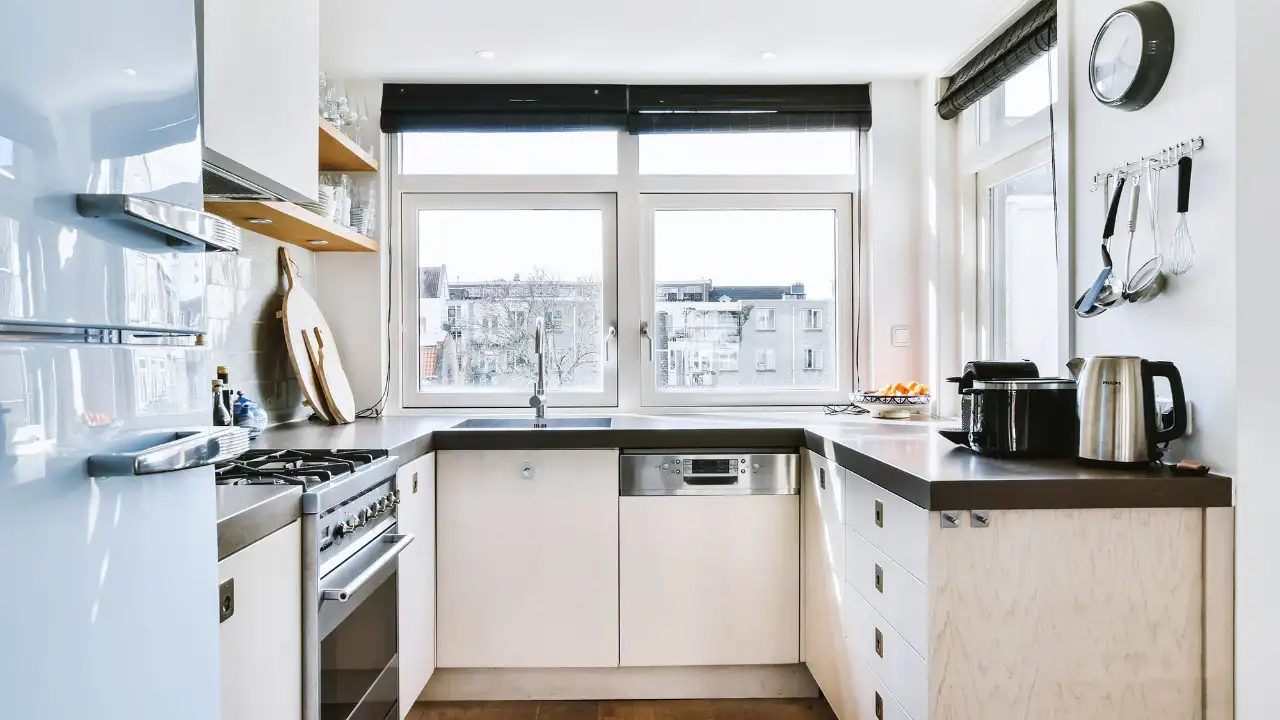
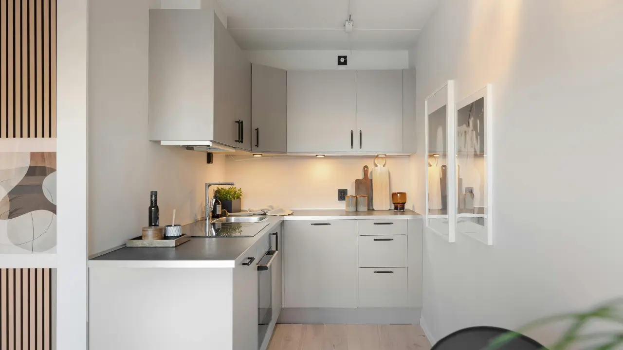
A colorful kitchen can make an ordinary cooking space feel more personal, welcoming, and visually interesting. But adding color does not mean every cabinet, wall, and accessory needs to be bright or bold.
The most successful colorful kitchens usually have a clear visual plan. One color takes the lead, another may provide contrast, while warm wood, stone, cream, white, or another neutral material gives the eye somewhere to rest.
That makes colorful kitchen ideas surprisingly versatile. You can create a soft sage-green kitchen, a dramatic navy space, a cheerful butter-yellow design, an earthy terracotta kitchen, or a colorful kitchen with mostly neutral cabinetry and a statement backsplash.
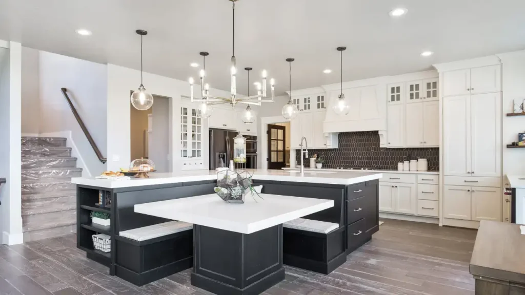
In this guide, you’ll find 25 practical ideas for adding color, plus cabinet color combinations, countertop and backsplash guidance, lighting tips, small-kitchen strategies, budget-friendly updates, common mistakes, and answers to frequently asked questions.
What Makes a Kitchen Colorful?
A colorful kitchen intentionally uses noticeable color as part of its overall design. The color might appear on cabinetry, an island, walls, backsplash tile, flooring, appliances, furniture, lighting, or smaller decorative elements.
Color can be:
- Bold and saturated
- Soft and muted
- Earthy and natural
- Pastel
- Deep and dramatic
- Warm
- Cool
- Playful
- Sophisticated
A kitchen does not have to use several bright colors to qualify as colorful. A room with deep green cabinets and warm cream walls can have just as much personality as a kitchen with blue cabinets, patterned tile, and colorful appliances.
Does a Colorful Kitchen Have to Be Bright?
No. Some of the most sophisticated colorful kitchens use muted or earthy shades.
Consider colors such as:
- Sage green
- Olive green
- Dusty blue
- Navy
- Deep teal
- Terracotta
- Clay
- Butter yellow
- Dusty pink
- Burgundy
- Soft lavender
The important consideration is how the color interacts with the rest of the room.
How Many Colors Should a Kitchen Have?
There is no universal number that every kitchen needs to follow.
A useful starting framework is:
Dominant color + supporting color + neutral or natural material
For example:
Deep green cabinets + warm white backsplash + natural oak
Or:
Blue island + cream cabinets + brass hardware
This approach gives each element a role and helps prevent the kitchen from feeling visually random.
Why Color Can Transform a Kitchen
Color can do more than decorate a kitchen. It can help establish a focal point, emphasize architectural features, create contrast, and connect the kitchen with nearby rooms.
For example, a colorful island can visually anchor a large open kitchen. A painted backsplash can draw attention to the cooking area. Colored lower cabinets can add personality while keeping upper cabinetry light.
Color can also change the perceived atmosphere of the room.
Deep green may create a grounded, dramatic feeling, while pale blue can feel lighter and calmer. Terracotta introduces warmth, whereas a cool blue-gray can create a cleaner appearance.
Before choosing a color, consider:
- Natural light
- Kitchen size
- Ceiling height
- Existing flooring
- Countertop color
- Cabinet style
- Adjacent rooms
- Artificial lighting
- Desired atmosphere
- How permanent the color choice will be
The goal is not simply to make the kitchen colorful. The goal is to make the color work with the kitchen.
25 Colorful Kitchen Ideas to Try in 2026
1. Sage Green Kitchen Cabinets
Sage green is an approachable way to bring color into a kitchen without relying on an extremely saturated shade.
Sage cabinets can work particularly well with:
- Natural oak
- Warm white
- Cream
- Beige
- Marble
- Brass
- Light wood flooring
For a modern look, combine simple sage cabinetry with clean countertops and minimal hardware. For a more traditional kitchen, consider Shaker-style doors, classic hardware, and natural stone.
One important consideration is lighting. Sage can appear more gray, green, warm, or cool depending on the surrounding materials and the light entering the room.
2. Deep Green Kitchen Cabinets
For a more dramatic approach, consider forest green, deep olive, or another rich green.
Deep green cabinets pair naturally with:
- Walnut
- Oak
- Cream
- Marble
- Brass
- Warm white
A deep green kitchen can look especially rich when natural materials are used to soften the darker cabinetry.
If you like dramatic interiors, combining deep green cabinetry with warm wood and carefully selected lighting can create a sophisticated result without requiring many additional colors.
For more inspiration, explore moody dark green kitchen design ideas.
3. Blue Kitchen Cabinets
Blue offers a broad range of possibilities, from pale powder blue to dark navy.
Popular directions include:
- Navy blue
- Dusty blue
- Slate blue
- Blue-gray
- Powder blue
- Deep blue
Navy cabinets can create a more formal appearance when combined with marble and brass. Powder blue can feel softer with white or cream. Blue-gray can provide color while remaining relatively understated.
Natural wood is another useful pairing because its warmth can balance the cooler qualities of blue.
4. Two-Tone Colorful Kitchen Cabinets
Two-tone cabinetry allows you to introduce color without covering every cabinet in the same bold shade.
Try combinations such as:
- Blue lower cabinets + white upper cabinets
- Green cabinets + cream uppers
- Navy perimeter cabinets + natural oak island
- Sage cabinets + walnut accents
- Terracotta cabinets + warm white
Another option is to use one color on the perimeter and a contrasting shade on the island.
The key is to create a relationship between the colors rather than selecting two unrelated shades simply because they look attractive individually.
5. Create a Colorful Kitchen Island
A colorful island can become the visual centerpiece of a kitchen.
Consider:
- Blue island with white cabinetry
- Green island with cream cabinets
- Navy island with light oak
- Terracotta island with warm neutrals
- Yellow island with soft white cabinetry
An island is particularly useful when you want to experiment with stronger color without committing the entire kitchen to it.
The island color can also be repeated through bar stools, pendant lighting, artwork, or small accessories.
6. Add Cheerful Yellow
Yellow can bring energy and warmth to a kitchen, but the exact shade makes a major difference.
Consider:
- Butter yellow
- Soft golden yellow
- Mustard
- Muted ochre
A soft butter yellow can feel gentle and welcoming with cream and natural wood. Mustard or ochre creates a stronger visual statement.
If yellow cabinetry feels too permanent, introduce it through a backsplash, stools, pendant lights, artwork, or smaller appliances.
7. Try a Terracotta Kitchen
Terracotta brings an earthy, warm character to kitchen design.
You can use terracotta through:
- Cabinetry
- Backsplash tile
- Walls
- Flooring
- Decorative pottery
- Textiles
Pair terracotta with:
- Cream
- Beige
- Natural oak
- Olive
- Sage
- Brass
Terracotta works particularly well when other materials remain relatively natural. Too many competing saturated colors can make the palette feel unnecessarily busy.
8. Use Soft Pink Kitchen Cabinets
Pink does not have to look overly playful.
Muted shades such as dusty rose, clay pink, or soft blush can create a distinctive kitchen when paired with sophisticated materials.
Try pink with:
- Walnut
- Cream
- Warm white
- Beige
- Brass
- Marble
A dusty pink island can also provide a subtle focal point without requiring the entire kitchen to use pink cabinetry.
The warmth of the pink should be considered alongside flooring and countertops so the room does not develop competing undertones.
9. Add Red Kitchen Accents
Red can be powerful, so it often works well as an accent rather than covering every surface.
Consider:
- A red island
- Red stools
- Red pendant lights
- Red appliances
- A red backsplash
- Red artwork
- Small red accessories
A restrained red accent can add energy to a neutral kitchen. Surrounding materials should remain relatively controlled if you want the red feature to stand out.
10. Choose Teal Cabinets
Teal combines qualities of blue and green, making it a strong choice for homeowners who want more personality than a traditional blue or green.
Teal works well with:
- Cream
- Warm white
- Natural oak
- Brass
- Beige
- Light stone
Because teal can have different blue and green undertones, always test a physical sample in the actual kitchen before committing to a large surface.
11. Install a Colorful Backsplash
A backsplash can become the main source of color in a kitchen.
Consider:
- Green ceramic tile
- Blue tile
- Terracotta tile
- Pink tile
- Geometric tile
- Mosaic tile
- Handmade-look tile
- Patterned ceramic tile
- Colorful glass tile
If your cabinets are already bold, a quieter backsplash may create better balance.
If your cabinetry is neutral, the backsplash can become the room’s primary color feature.
12. Add Color Without Repainting Cabinets
You do not need new cabinets to create a colorful kitchen.
Keep neutral cabinetry and introduce color through:
- Walls
- Backsplash
- Island
- Bar stools
- Pendant lights
- Artwork
- Small appliances
- Window treatments
- Open shelving
- Ceramics
This approach is especially useful if the existing cabinets are in good condition.
It also allows you to experiment with color before making a permanent investment.
13. Use Colorful Appliances
A colorful appliance can function almost like a piece of furniture.
Depending on the design, consider appliances in:
- Cream
- Green
- Blue
- Red
- Black
- Soft pastel shades
A statement range or refrigerator can create a focal point without requiring colorful cabinetry.
However, think about the long-term design before choosing an unusual appliance finish. Replacement availability, coordination with future appliances, and the rest of the kitchen should all be considered.
14. Make the Range Hood a Color Feature
The range hood is an opportunity to add architectural interest.
Ideas include:
- Deep green hood
- Blue hood
- Terracotta hood
- Painted plaster-style hood
- Wood hood surrounded by colorful cabinetry
- Contrasting hood color
A colored hood can visually connect the cabinets, backsplash, ceiling, and cooking area.
In a larger kitchen, it can also provide a natural focal point without introducing another large decorative object.
15. Combine Color With Natural Wood
Color and wood are a particularly flexible combination.
Try:
- Sage + oak
- Navy + walnut
- Terracotta + oak
- Deep green + natural wood
- Teal + light wood
- Dusty blue + medium oak
Natural wood introduces texture and warmth while helping prevent a colorful kitchen from feeling overly flat.
Wood can appear on an island, shelving, flooring, ceiling details, furniture, or selected cabinet sections.
See also warm wood kitchen trends for additional material ideas.
16. Pair Colorful Cabinets With White Countertops
White and warm-white countertops can provide visual breathing room around colorful cabinetry.
They can work with:
- Green
- Blue
- Navy
- Yellow
- Pink
- Teal
- Terracotta
The distinction between cool white and warm white matters.
A bright, cool white may create crisp contrast with blue. A warmer white can be more harmonious with terracotta, yellow, olive, or warm green.
Always compare the countertop sample directly against the cabinet sample.
17. Combine Colorful Cabinets With Natural Stone
Natural stone can provide texture and movement against colorful cabinetry.
Possible materials include:
- Marble
- Quartzite
- Granite
- Soapstone
- Limestone-inspired surfaces
The main consideration is visual competition.
If the stone has strong veining, examine how its colors interact with the cabinet color. A colorful cabinet may look beautiful against a complex slab, but the combination should be evaluated using a large sample whenever possible.
18. Add Brass Hardware
Brass can create a warm accent against many colorful cabinet finishes.
It can work particularly well with:
- Deep green
- Navy
- Teal
- Terracotta
- Pink
- Cream
Repeat the finish thoughtfully through cabinet pulls, faucets, pendant lights, or selected accessories.
The objective is not to make every metal surface brass. Instead, use enough repetition to make the finish feel intentional.
19. Mix Metals Carefully
A colorful kitchen does not necessarily need one metal finish everywhere.
Possible combinations include:
- Brass + black
- Brass + nickel
- Bronze + brass
- Black + stainless steel
The easiest approach is usually to choose one dominant metal and use a secondary finish selectively.
For example, brass hardware can remain the primary decorative finish while black appears through lighting or furniture.
20. Paint the Kitchen Walls
Walls offer one of the easiest ways to experiment with color.
Possible wall colors include:
- Deep green
- Dusty blue
- Warm yellow
- Terracotta
- Soft pink
- Muted lavender
- Warm cream
Wall color is also relatively easy to change compared with cabinetry, countertops, or flooring.
For an open-plan kitchen, consider how the wall color transitions into the living or dining area.
21. Paint the Ceiling
A colorful ceiling can create an unexpected design feature.
Consider:
- Pale blue
- Soft green
- Muted yellow
- Terracotta
- Warm cream
- Deep navy
A ceiling does not need to be dramatically darker than the walls. Even a subtle color can change the atmosphere of the room.
Consider ceiling height, natural light, cabinetry, and wall color before selecting the shade.
22. Make a Small Kitchen Colorful
A small kitchen can absolutely use color.
The key is controlling visual complexity.
Try:
- One dominant cabinet color
- Colorful lower cabinets
- Light upper cabinets
- A statement backsplash
- A colorful island where space allows
- Light countertops
- Reflective surfaces
- Glass-front cabinetry
- Consistent flooring
- Minimal countertop clutter
For example, deep green lower cabinets with warm white upper cabinets can introduce personality while keeping the upper portion of the room visually lighter.
Explore small kitchen ideas for additional space-conscious design strategies.
23. Design a Colorful Open-Plan Kitchen
Open-plan kitchens need to work visually with adjacent spaces.
Rather than treating the kitchen as an isolated room, look at:
- Living-room colors
- Dining furniture
- Flooring
- Wall color
- Window treatments
- Wood finishes
Repeating one accent color elsewhere in the open-plan area can create continuity.
For example, a blue kitchen island could connect visually with blue artwork or upholstery in the nearby dining or living space.
24. Try a Vintage-Inspired Color Palette
Vintage-inspired kitchens can use colors such as:
- Mint green
- Butter yellow
- Soft blue
- Cream
- Muted red
Combine these with:
- Retro-style appliances
- Checkerboard flooring
- Classic hardware
- Traditional tile
- Vintage-inspired lighting
You can still incorporate modern appliances, efficient storage, and contemporary work surfaces so the kitchen remains practical.
25. Create an Earthy, Organic Colorful Kitchen
For a quieter interpretation of colorful kitchen design, combine earthy shades with natural materials.
Consider:
- Olive
- Sage
- Terracotta
- Clay
- Warm beige
- Natural wood
- Stone
This palette can feel colorful without relying on highly saturated shades.
It is particularly useful for homeowners who like the personality of color but prefer an organic modern atmosphere.
Best Colors for Kitchen Cabinets
There is no single best cabinet color for every kitchen. The right choice depends on natural light, existing materials, room proportions, personal preference, and the atmosphere you want to create.
| Cabinet Color | Overall Feel | Good Pairings | Main Consideration |
|---|---|---|---|
| Sage Green | Soft and natural | Oak, cream, brass | Can shift under different lighting |
| Deep Green | Dramatic and organic | Walnut, marble, brass | Needs visual balance |
| Navy | Classic and refined | White, oak, brass | Can appear dark |
| Dusty Blue | Calm and airy | White, wood, nickel | Undertones matter |
| Teal | Rich and expressive | Cream, oak, brass | Saturation should be tested |
| Terracotta | Warm and earthy | Beige, oak, olive | Strong warmth can dominate |
| Butter Yellow | Cheerful | White, wood, brass | Shade intensity matters |
| Dusty Pink | Soft and distinctive | Walnut, cream, brass | Coordinate warm undertones |
| Charcoal | Bold and versatile | Oak, white, bronze | Requires adequate lighting |
Think about the entire material palette rather than selecting cabinetry in isolation.
Colorful Kitchen Color Combinations That Work
Green + Natural Wood
Green cabinetry paired with oak or walnut creates a natural contrast between painted color and organic texture.
Navy + Cream
Cream softens navy and can create a more welcoming result than stark white.
Sage + Warm White
This is a useful combination for homeowners who want color without strong contrast.
Teal + Brass
Teal and brass create a more expressive palette. Keep the surrounding materials relatively controlled so both elements remain intentional.
Terracotta + Cream
Terracotta adds warmth while cream prevents the room from becoming visually heavy.
Blue + Natural Oak
The warmth of oak can balance the cooler qualities of blue.
Yellow + White
Soft yellow paired with white can create a bright and cheerful kitchen.
Pink + Walnut
Dusty pink and walnut create contrast through both color temperature and material texture.
Olive + Beige
Olive and beige provide an earthy palette that can work well with natural materials.
Green + Marble
Green cabinetry can provide a strong base for marble’s natural movement. Choose the stone carefully so the veining does not compete with the cabinet color.
How to Build a Color Palette for Your Kitchen
Choosing individual colors is easier when you work from the entire room rather than selecting paint first.
Step 1: Identify Existing Permanent Materials
Start with the finishes that are expensive or difficult to change:
- Flooring
- Countertops
- Cabinetry
- Appliances
- Stone
- Backsplash
These materials establish the foundation.
Step 2: Choose Your Dominant Color
Your dominant color might appear on the cabinets, island, walls, or another large surface.
Examples include:
- Sage
- Navy
- Olive
- Teal
- Terracotta
- Yellow
Step 3: Choose a Supporting Color
The supporting color should complement rather than compete with the dominant shade.
Step 4: Add a Neutral
Useful neutrals include:
- Warm white
- Cream
- Beige
- Taupe
- Soft gray
Step 5: Add Natural Texture
Wood, stone, ceramic, rattan, and other natural materials can keep the palette from feeling flat.
Step 6: Select a Metal Finish
Brass, bronze, black, chrome, or nickel can become the finishing accent.
Test Samples Before Making Permanent Decisions
Never rely only on an online image or small digital color swatch.
Look at physical samples:
- In morning light
- In afternoon light
- Under evening lighting
- Beside the countertop
- Beside the flooring
- Next to existing cabinets
- Against adjacent walls
A color that looks perfect on a screen may look significantly different in your actual kitchen.
Best Countertops for Colorful Kitchen Cabinets
White Quartz
White quartz can create a clean background for colorful cabinetry and is particularly useful when the cabinets are visually strong.
Warm-White Quartz
Warm white can complement earthy greens, terracotta, yellow, and other warm colors.
Marble
Marble introduces natural movement and can work beautifully with deep green, navy, or other strong cabinet colors.
Quartzite
Quartzite offers natural-stone character and can create a more substantial visual statement.
Granite
Granite is available in a wide range of colors and patterns, making it possible to coordinate with many cabinet palettes.
Soapstone
Soapstone can work well with darker, earthy, or traditional colorful kitchens.
Wood or Butcher Block
Wood countertops introduce warmth and texture, although homeowners should consider moisture, heat, scratches, sealing, and maintenance requirements.
Should the Countertop Be Neutral?
Not necessarily.
A neutral countertop is often easier to coordinate with colorful cabinets, but a dramatic stone can also work when its colors connect naturally with the rest of the kitchen.
Colorful Kitchen Backsplash Ideas
The backsplash is one of the easiest places to create a visual focal point.
Consider:
- Green tile
- Blue tile
- Terracotta tile
- Pink tile
- Yellow tile
- Patterned tile
- Mosaic tile
- Handmade-look tile
- Colorful glass tile
- Natural stone
If the cabinets already have a strong color, a neutral backsplash can prevent the room from becoming overly busy.
If the cabinets are neutral, a colorful backsplash can provide most of the kitchen’s personality.
Flooring That Works With a Colorful Kitchen
Flooring should support the kitchen’s color palette rather than compete with it.
Options include:
- Natural oak
- Medium-toned wood
- Dark wood
- Terrazzo
- Neutral porcelain tile
- Natural stone
- Patterned tile
- Checkerboard flooring
Patterned Flooring With Colorful Cabinets
Pattern can work beautifully with colorful cabinetry, but the colors in the flooring should connect with the rest of the room.
If you already have a bold backsplash, patterned flooring, and colorful cabinets, adding another strong pattern may make the kitchen feel unnecessarily busy.
Best Hardware for Colorful Kitchen Cabinets
Hardware is a relatively small detail, but it can significantly influence the finished appearance.
Consider:
- Brass
- Bronze
- Black
- Chrome
- Polished nickel
- Stainless steel
Brass With Green Cabinets
Brass introduces warmth and contrast.
Black Hardware With Colorful Cabinets
Black provides a sharper, more graphic contrast.
Nickel With Blue Cabinets
Nickel can create a cooler and cleaner appearance.
Bronze With Earthy Colors
Bronze can work naturally with olive, terracotta, brown, and warm neutral palettes.
The size and shape of the hardware also matter. Long pulls can emphasize horizontal cabinet lines, while knobs can create a more traditional appearance.
How to Light a Colorful Kitchen
Lighting is especially important when working with color because illumination can change how finishes appear.
Ambient Lighting
Provides general illumination throughout the room.
Task Lighting
Helps illuminate preparation and cooking areas.
Under-Cabinet Lighting
Improves countertop visibility while also highlighting the backsplash.
Pendant Lighting
Pendant fixtures can introduce another decorative element through color, shape, or metal finish.
Cabinet Interior Lighting
Useful for glass-front cabinets and display areas.
Accent Lighting
Accent lighting can highlight shelves, artwork, architectural features, or decorative objects.
Use Dimmers
Dimmers can help the kitchen adapt from bright daytime cooking to a softer evening atmosphere.
Test Color Under Actual Lighting
A cabinet color can look different in daylight compared with warm artificial lighting.
Test samples under the lighting conditions you will actually use.
How to Make a Colorful Kitchen Look Sophisticated
Colorful does not have to mean chaotic.
Use these principles:
- Choose one dominant color.
- Repeat important colors intentionally.
- Give strong colors room to breathe.
- Use neutral materials for balance.
- Add natural wood or stone.
- Limit competing patterns.
- Coordinate metal finishes.
- Keep countertops visually organized.
- Consider colors in adjacent rooms.
- Test the complete palette before installation.
The goal is not to remove personality. It is to give the personality structure.
How to Create a Modern Colorful Kitchen
A colorful kitchen can still have a clean contemporary appearance.
Choose Simple Cabinet Profiles
Flat-panel and simple Shaker cabinetry can provide a restrained foundation for stronger colors.
Keep Hardware Intentional
Simple pulls and knobs can prevent colorful cabinetry from becoming visually cluttered.
Use Contemporary Lighting
Modern pendants, linear fixtures, and understated recessed lighting can reinforce the design direction.
Coordinate Countertops
Choose a countertop that supports the cabinet color rather than competing with it.
Use Controlled Color Blocking
A strong color on an island or lower cabinets can create a modern graphic effect without covering every surface.
How to Add Color to a Small Kitchen
Small kitchens do not need to be completely neutral.
Instead, think about where the eye travels.
Useful strategies include:
- One dominant cabinet color
- Light upper cabinets
- Colorful lower cabinets
- A focused backsplash
- Light countertops
- Reflective surfaces
- Glass-front cabinets
- Consistent flooring
- Minimal countertop clutter
A colorful lower cabinet paired with a light upper section can provide personality while keeping the upper portion of the kitchen visually open.
There is no universal rule that small kitchens must use only pale colors. The amount of natural light and the balance of surrounding materials matter more than a simple light-versus-dark formula.
Colorful Kitchen Ideas for Large Spaces
Larger kitchens can accommodate more visual variation, but size alone does not mean you need more colors.
Potential features include:
- Full-height colorful cabinetry
- Large statement islands
- Colorful range hoods
- Patterned backsplashes
- Open shelving
- Statement pendant lights
- Colorful dining areas
- Two-tone cabinets
Use the architecture as your guide.
A large kitchen can still look sophisticated with one dominant cabinet color and natural materials.
How to Mix Colors Without Making a Kitchen Look Busy
A simple structure can make multiple colors easier to manage.
Dominant Color
Use the largest colored surface for your primary shade.
Supporting Color
Introduce a second color in a smaller area.
Neutral
Use cream, white, beige, or another restrained shade to provide visual breathing room.
Natural Material
Wood and stone add texture without requiring another strong color.
Accent Color
Use an accent through hardware, artwork, lighting, furniture, or accessories.
For example:
Deep green + cream + natural oak + brass
Or:
Dusty blue + warm white + walnut + black
These combinations feel connected because every element has a clear role.
Colorful Kitchens for Different Interior Styles
Modern Colorful Kitchen
Consider:
- Flat-panel cabinets
- Bold island
- Minimal hardware
- Refined stone
- Contemporary lighting
- Limited decorative objects
Organic Modern Colorful Kitchen
Try:
- Sage
- Olive
- Natural wood
- Stone
- Handmade ceramics
- Warm neutrals
Colorful Transitional Kitchen
Combine:
- Shaker cabinets
- Blue or green
- Natural stone
- Brass
- Classic proportions
Colorful Traditional Kitchen
Consider:
- Detailed cabinetry
- Deep colors
- Marble
- Classic hardware
- Decorative lighting
Colorful Japandi Kitchen
Use color more quietly through:
- Muted green
- Dusty blue
- Natural wood
- Soft neutrals
- Simple forms
Colorful Farmhouse Kitchen
Consider:
- Sage
- Butter yellow
- Soft blue
- Cream
- Natural wood
Colorful Maximalist Kitchen
A maximalist kitchen can combine:
- Multiple colors
- Patterned tile
- Decorative wallpaper
- Statement lighting
- Layered accessories
The challenge is coordination. Multiple strong elements need visual relationships so the result feels deliberate rather than accidental.
Budget-Friendly Ways to Add Color to a Kitchen
A colorful kitchen does not necessarily require a complete renovation.
Consider these relatively flexible updates:
- Paint existing cabinets
- Paint the walls
- Replace cabinet hardware
- Add colorful stools
- Install a backsplash
- Change pendant lights
- Add artwork
- Introduce colorful ceramics
- Add open shelving
- Replace textiles
- Add colorful small appliances
Where to Prioritize Your Budget
For a larger renovation, practical elements usually deserve careful planning.
Prioritize:
- Kitchen layout
- Cabinet functionality
- Storage
- Lighting
- Countertop durability
- Proper installation
- Ventilation where applicable
Decorative elements can often be changed later.
How to Add Color Without Remodeling the Entire Kitchen
If the existing kitchen works functionally, you may not need a complete renovation.
Step 1: Identify the Existing Foundation
Look at:
- Cabinets
- Countertops
- Flooring
- Appliances
- Backsplash
Step 2: Choose One Main Color
Select a shade that works with the permanent finishes.
Step 3: Start With a Changeable Element
Try:
- Wall paint
- Hardware
- Stools
- Artwork
- Lighting
Step 4: Add a Larger Color Feature
If you like the direction, consider a backsplash, island, or cabinet paint.
Step 5: Introduce Natural Texture
Wood, stone, ceramic, and woven materials can balance stronger colors.
Step 6: Repeat the Color
Use the chosen shade in two or three locations so it feels intentional rather than isolated.
Colorful Kitchen Mistakes to Avoid
1. Using Too Many Unrelated Colors
A large number of unrelated saturated colors can make the kitchen feel visually fragmented.
2. Choosing Colors Only From Online Photos
Screens do not reproduce every paint, stone, wood, and lighting condition accurately.
Use physical samples whenever possible.
3. Ignoring Natural Light
A color can look substantially different depending on window direction, surrounding buildings, and time of day.
4. Forgetting Undertones
Two whites can have very different undertones. The same is true for beige, gray, green, blue, and pink.
5. Combining Too Many Patterns
Colorful cabinetry, patterned backsplash, patterned flooring, and heavily veined countertops can compete for attention.
6. Making Everything Match Exactly
A kitchen can feel more natural when colors and materials coordinate without being identical.
7. Using Too Many Statement Pieces
If the island, hood, backsplash, lighting, and appliances are all competing focal points, none may feel intentional.
8. Ignoring Adjacent Rooms
This is especially important in open-plan homes.
9. Choosing a Color Only Because It Is Trendy
A trend can provide inspiration, but the kitchen should still suit your preferences and daily life.
10. Forgetting Lighting
A beautiful color under daylight may appear very different under artificial lighting.
11. Using Too Many Metal Finishes
Mixed metals can work, but they should have a clear visual hierarchy.
12. Ignoring Hardware Scale
Hardware should relate to cabinet dimensions and the overall design.
13. Forgetting Flooring Undertones
A colorful cabinet may clash with flooring that has a strongly contrasting undertone.
14. Prioritizing Color Over Function
The kitchen still needs an efficient workflow, adequate storage, comfortable circulation, and useful lighting.
15. Making Permanent Decisions Too Quickly
Test the palette before committing to expensive finishes.
How Natural Light Changes Kitchen Colors
Natural light can have a major influence on how color is perceived.
Rather than treating room orientation as a strict decorating formula, evaluate the actual room.
Consider:
- Window size
- Direction of the windows
- Nearby buildings
- Trees and outdoor surroundings
- Time of day
- Artificial lighting
- Flooring
- Countertop reflections
- Wall color
A north-facing room may feel different from a strongly sunlit room, while morning and afternoon light can produce noticeably different impressions.
The most reliable approach is simple: test the actual color in the actual room at different times of day.
What Colorful Kitchen Projects Can You DIY?
| Project | DIY Potential | Professional Consideration |
|---|---|---|
| Wall painting | High | Usually optional |
| Hardware replacement | High | Usually unnecessary |
| Styling | High | Usually unnecessary |
| Cabinet painting | Medium | Preparation and finish quality matter |
| Open shelving | Medium | Wall structure matters |
| Backsplash | Medium | Depends on material and installation |
| Light fixture replacement | Medium/Low | Electrical requirements vary |
| Cabinet installation | Low/Medium | Professional installation may be appropriate |
| Countertop installation | Low | Professional installation |
| Plumbing | Low | Qualified professional |
| Electrical work | Low | Qualified professional |
| Structural changes | Low | Professional involvement may be required |
Electrical, plumbing, gas, ventilation, and structural work should follow applicable local requirements and be handled by appropriately qualified professionals where required.
How to Maintain Colorful Kitchen Finishes
Maintenance depends more on the material and finish than on the color itself.
Painted Cabinets
Consider:
- Fingerprints
- Scuffs
- Cleaning products
- Touch-up requirements
- Finish durability
Natural Wood
Pay attention to:
- Moisture
- Heat
- Cleaning
- Surface finish
Colorful Tile
Regularly consider:
- Grout cleaning
- Staining
- Water exposure
- Manufacturer care recommendations
Stone
Different stone types have different cleaning and maintenance requirements.
Colorful Appliances
Follow the manufacturer’s instructions for the specific finish.
Before selecting a material, understand how it should be cleaned and maintained in the conditions of your kitchen.
Which Colorful Kitchen Features Should You Prioritize?
| Feature | Visual Impact | Functional Value | Planning Importance |
|---|---|---|---|
| Quality cabinetry | High | High | High |
| Efficient layout | Medium | High | High |
| Lighting | High | High | High |
| Durable countertop | High | High | High |
| Colorful island | High | High | Medium–High |
| Backsplash | High | Medium | Medium |
| Hardware | Medium | Medium | Medium |
| Decorative accessories | Medium | Low | Low |
These are planning considerations rather than universal rankings. The right priorities depend on whether you are building a new kitchen, remodeling, or simply refreshing an existing space.
Colorful Kitchen Ideas FAQs
What Are the Best Colors for a Colorful Kitchen?
There is no universal best color.
Green, blue, sage, navy, teal, yellow, terracotta, pink, olive, and burgundy can all work depending on the room.
The right choice depends on natural light, existing materials, kitchen size, desired atmosphere, and personal preference.
What Is the Most Popular Kitchen Cabinet Color?
There is no single color that is universally the most popular for every market, home style, and design period.
Instead of choosing a color solely because it is popular, consider whether it works with your kitchen’s permanent materials and your own preferences.
How Many Colors Should a Kitchen Have?
There is no mandatory number.
A useful framework is:
Dominant color + supporting color + neutral or natural material
You can then introduce smaller accents through hardware, lighting, furniture, and accessories.
What Colors Go Together in a Kitchen?
Some combinations to consider include:
- Green + cream + oak
- Navy + white + walnut
- Sage + warm white + brass
- Terracotta + beige + oak
- Teal + cream + brass
- Blue + natural oak
Always compare physical samples because undertones can change how colors interact.
Are Colorful Kitchens Still Popular in 2026?
Color continues to be an important design option for kitchens, particularly through cabinetry, islands, backsplashes, walls, and decorative elements.
Rather than assuming one color or style is universally preferred, focus on how the palette works with the architecture and materials of the individual kitchen.
What Is the Best Color for a Small Kitchen?
There is no universal best color for every small kitchen.
Natural light, ceiling height, cabinetry arrangement, countertop color, flooring, and visual clutter all influence the result.
A controlled dark color can work in a small kitchen just as a light color can, provided the complete palette is balanced.
Should Kitchen Cabinets and Walls Be the Same Color?
They can be, but they do not have to be.
Options include:
- Color drenching
- Tonal colors
- Contrasting walls
- Neutral walls with colorful cabinets
- Colorful walls with neutral cabinetry
Choose based on the visual effect you want and how the kitchen connects with the rest of the home.
What Countertops Work With Colorful Cabinets?
Potential options include:
- White quartz
- Warm-white quartz
- Marble
- Quartzite
- Granite
- Soapstone
- Wood
The best choice depends on the cabinet color, stone pattern, maintenance requirements, and overall design.
What Hardware Looks Good With Colorful Cabinets?
Common choices include:
- Brass
- Bronze
- Black
- Nickel
- Chrome
- Stainless steel
The best finish depends on the cabinet color and the other metals already present in the room.
Can I Add Color Without Replacing My Cabinets?
Yes.
You can introduce color through:
- Paint
- Backsplash
- Hardware
- Lighting
- Furniture
- Artwork
- Appliances
- Accessories
- Wall color
This can be a practical way to test a color direction before making a larger renovation investment.
How Do I Make a Colorful Kitchen Look Expensive?
Focus on coordination rather than simply adding expensive-looking decorations.
Useful principles include:
- Good proportions
- Quality-looking hardware
- Coordinated undertones
- Natural materials
- Good lighting
- Clean countertops
- Consistent finishes
- Fewer but more intentional decorative elements
A well-planned palette often has more visual impact than simply adding more decorative features.
Final Thoughts on Colorful Kitchen Ideas
The most successful colorful kitchens are not necessarily the ones with the most color.
They are the kitchens where every color has a purpose.
Start with the permanent materials in the room. Choose a dominant color, introduce a supporting shade, and use neutral or natural materials to create visual breathing room.
Test samples in real lighting. Compare cabinet colors with flooring, countertops, backsplashes, and nearby walls. Think about how the kitchen connects with the rest of your home, especially if you have an open floor plan.
If you are hesitant about a permanent bold choice, start with changeable elements such as wall paint, hardware, stools, artwork, lighting, or accessories. If the color works, you can gradually introduce it into larger surfaces.
Ultimately, the best colorful kitchen ideas are the ones that balance personality with function. A colorful kitchen should still be comfortable to use, easy to maintain, visually connected to the home, and suited to the people who live there.