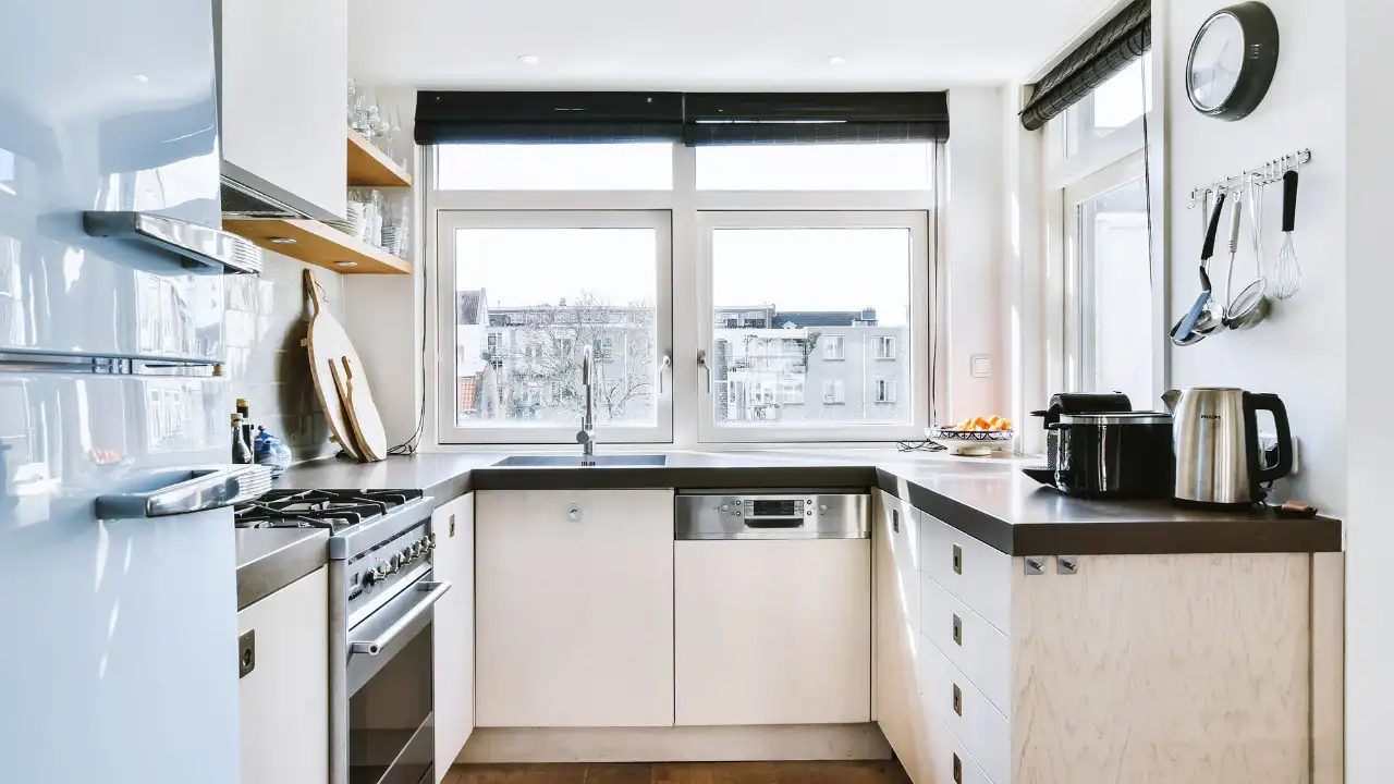
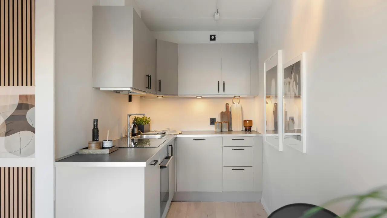
Choosing a cabinet color can completely change how a kitchen feels. The right shade can make the room feel brighter, warmer, calmer, more dramatic, or more connected to the rest of the home. The wrong one can clash with your flooring, countertop, lighting, or existing finishes even if the color looked perfect in a showroom.
That is why the best kitchen cabinet color is not simply the one that looks attractive in a photograph. It needs to work with the actual conditions of your kitchen.
Natural light, room size, flooring, countertops, backsplash, hardware, wall color, and the atmosphere you want all influence the final result.
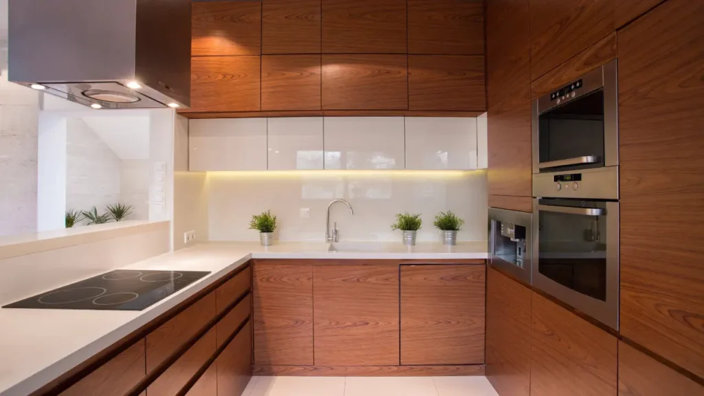
In this guide, you’ll find practical kitchen cabinet color ideas for modern, minimalist, organic, farmhouse, luxury, small, large, bright, dark, and open-plan kitchens. More importantly, you’ll learn how to compare colors and choose one that makes sense for your own space.
How to Choose the Right Kitchen Cabinet Color
Before choosing a paint color, stain, or cabinet finish, look at the elements that are already fixed in your kitchen. Cabinets are a major visual surface, so their color should support the rest of the room rather than compete with it.
Start With Natural Light
Light changes how cabinet colors are perceived.
A color that looks creamy in one room may appear noticeably different in another because of window direction, surrounding surfaces, shadows, and artificial lighting.
Instead of judging a color from an online photograph, place a large sample in your kitchen and observe it throughout the day.
Pay attention to:
- Morning light
- Midday light
- Afternoon light
- Evening artificial lighting
- Shadows around cabinets
- Reflections from countertops and floors
If your kitchen receives limited daylight, warmer light neutrals can help create a softer atmosphere. Bright kitchens give you more flexibility to experiment with deeper colors.
Consider Kitchen Size
Small kitchens often benefit from colors that create visual openness, such as warm white, cream, light greige, or light wood.
However, dark cabinets are not automatically wrong for a small kitchen. A compact room can still look sophisticated with charcoal, navy, or deep green when the lighting, ceiling height, surrounding finishes, and contrast are carefully planned.
Look at Your Flooring
Your cabinets do not need to match your floor exactly.
Instead, compare their undertones and visual weight.
For example, warm wood flooring often works naturally with cream, taupe, warm white, sage, oak, and walnut. A cooler floor may pair better with certain gray, blue, or neutral cabinet tones.
The goal is coordination rather than duplication.
Consider the Countertop
Countertops often remain in place longer than paint colors, so they should influence your cabinet choice.
Consider whether your countertop is:
- Plain white
- Warm white
- Veined marble
- Quartz with subtle movement
- Dark stone
- Wood
- Concrete-look
- Highly patterned
If the countertop already has strong veining or visual movement, calmer cabinetry can create a more balanced composition.
Think About the Mood You Want
Ask yourself what you want the kitchen to feel like.
Bright and airy: warm white, cream, light oak
Warm and cozy: taupe, beige, walnut, cream
Calm: sage, soft blue, warm neutrals
Dramatic: black, charcoal, navy, deep green
Natural: oak, sage, beige, warm white
Luxury: walnut, cream, deep green, charcoal
This question can narrow your options much faster than browsing hundreds of paint colors.
Consider Adjacent Rooms
This is particularly important in open-plan homes.
Your kitchen cabinetry should relate visually to nearby:
- Living room furniture
- Dining furniture
- Flooring
- Wall colors
- Lighting
- Wood finishes
- Decorative metals
A kitchen can have its own personality without looking disconnected from the rest of the house.
25 Best Kitchen Cabinet Color Ideas for 2026
The following colors and combinations are not ranked from universally best to worst. Each works under different conditions.
For every option, consider the color itself, what it pairs with, where it works best, and what to watch out for.
1. Warm White Kitchen Cabinets
Warm white remains one of the most versatile choices for a kitchen because it provides brightness without necessarily feeling as stark as a very cool white.
It works especially well with natural wood, warm stone, brass, oak flooring, and soft neutral walls.
Best pairings: oak, walnut, beige stone, marble-look surfaces, brass.
Best for: small kitchens, transitional kitchens, modern kitchens, and bright spaces.
Watch out for: a warm white can look noticeably yellow or creamy beside a very cool countertop or backsplash. Compare samples against your fixed materials before committing.
2. Cream Kitchen Cabinets
Cream offers a softer alternative to bright white. It can create a relaxed, welcoming kitchen while still maintaining a polished appearance.
Cream cabinets are particularly effective in warm modern kitchens where pure white might feel too sharp.
Pair them with oak, walnut, warm stone, brass, or beige walls.
Best for: warm modern, traditional-modern, organic, and transitional interiors.
Watch out for: choosing a cream with an undertone that conflicts with the floor or countertop.
3. Greige Kitchen Cabinets
Greige combines characteristics of gray and beige, creating a flexible neutral that can sit between warm and cool design elements.
It can be an excellent choice when you want something more distinctive than white without committing to a strong color.
Try greige with:
- Light stone
- Black hardware
- Natural oak
- Walnut
- Warm white walls
Best for: modern, minimalist, transitional, and contemporary-inspired kitchens.
Watch out for: greige can shift considerably depending on lighting and surrounding colors, so large samples are especially useful.
4. Taupe Kitchen Cabinets
Taupe brings a sophisticated earthy quality to cabinetry without becoming as visually heavy as some dark colors.
It works beautifully with natural stone, walnut, brushed metal, and warm white.
Best for: cozy modern kitchens and refined neutral interiors.
Watch out for: too many similar brown-gray tones can make the room feel flat. Introduce contrast through texture or a lighter countertop.
5. Beige Kitchen Cabinets
Modern beige is far removed from the overly yellow or dated beige sometimes associated with older kitchens.
A carefully selected beige can look soft, architectural, and contemporary when paired with simple cabinet profiles and modern hardware.
Consider:
- Beige + white stone
- Beige + oak
- Beige + black accents
- Beige + brushed brass
Best for: warm minimalist and organic-modern kitchens.
6. Light Gray Kitchen Cabinets
Light gray offers a clean appearance and can work well with white countertops, stainless finishes, light wood, and cooler architectural elements.
However, not all gray is the same.
Cool gray can feel crisp, while warmer gray can create a softer atmosphere.
Best for: contemporary and minimalist kitchens.
Watch out for: cool gray can feel visually cold when combined with cool flooring, cool lighting, and little natural texture.
7. Sage Green Kitchen Cabinets
Sage green has a muted quality that makes it easier to integrate than highly saturated green.
It pairs naturally with:
- Oak
- Cream
- Warm white
- Brass
- Stone
- Greenery
Sage can work especially well in modern organic and warm minimalist kitchens.
Best for: homeowners who want color without an overwhelming statement.
8. Deep Green Kitchen Cabinets
Deep green creates more drama than sage while retaining an earthy character.
Forest-inspired and muted deep greens can work particularly well with warm lighting, natural wood, light stone, and brass.
Best for: large kitchens, statement islands, moody kitchens, and modern organic designs.
Watch out for: deep cabinetry needs a deliberate lighting plan. Without enough visual contrast, the kitchen can feel heavier than intended.
For more inspiration, a related moody dark green kitchen design guide can help you explore deeper green combinations.
9. Soft Blue Kitchen Cabinets
Soft blue can introduce color while keeping the overall kitchen visually calm.
Dusty blue, powdery blue, and muted blue-gray tones work well with:
- White countertops
- Light oak
- Brushed nickel
- Warm white walls
- Natural textures
Best for: calm, coastal-influenced, farmhouse-modern, and transitional kitchens.
10. Navy Blue Kitchen Cabinets
Navy creates depth without the intensity of true black.
A navy island can become a strong focal point while keeping lighter perimeter cabinets.
Another effective combination is navy cabinetry with warm white walls, light stone, and brass hardware.
Best for: larger kitchens, islands, traditional-modern spaces, and dramatic designs.
11. Charcoal Kitchen Cabinets
Charcoal provides the visual depth of a dark cabinet without appearing quite as stark as pure black.
It pairs particularly well with light countertops, natural wood, warm lighting, and metallic accents.
Best for: modern, contemporary, and sophisticated kitchens.
Watch out for: if the entire room is dark, add lighter or reflective surfaces to maintain visual balance.
12. Black Kitchen Cabinets
Black cabinetry can create a dramatic architectural statement.
The key is not simply choosing black but deciding how to balance it.
Combine black cabinets with:
- Natural oak
- Light stone
- Warm white walls
- Reflective backsplash surfaces
- Carefully placed lighting
Best for: modern luxury and dramatic kitchens.
Black also works effectively when limited to an island or lower cabinetry rather than used throughout the entire room.
13. Natural Oak Cabinets
Natural oak provides color and texture at the same time.
The grain creates visual interest without requiring a painted statement color, making oak particularly useful for warm modern, Scandinavian-inspired, and organic kitchens.
Consider:
- White oak
- Light oak
- Natural oak
- Oak veneer
Best for: warm modern, minimalist, Scandinavian-inspired, and organic-modern kitchens.
14. Walnut Kitchen Cabinets
Walnut introduces a deeper brown tone and a refined natural character.
It works especially well against cream, warm white, light stone, brass, and black accents.
Because walnut has substantial visual presence, you can keep surrounding materials relatively restrained.
Best for: sophisticated modern and luxury kitchens.
15. Ash Wood Cabinets
Ash generally provides a lighter wood character and can work beautifully in bright kitchens.
Its visible grain gives a minimalist space enough texture without introducing a strong paint color.
Best for: Scandinavian-inspired, minimalist, and bright modern kitchens.
Pair it with warm white, soft gray, light stone, or restrained metal accents.
16. Two-Tone White and Wood Cabinets
White perimeter cabinets with a natural wood island are among the easiest two-tone combinations to adapt.
The white keeps the surrounding cabinetry light while the wood creates a warmer focal point.
Another option is cream cabinetry with a walnut island.
Best for: modern, transitional, organic, and family kitchens.
The main advantage is balance: you get contrast without introducing several unrelated colors.
17. Green and Natural Wood Cabinets
Green cabinetry becomes softer and more organic when paired with natural wood.
Try sage or deep green with oak shelving, an oak island, or wood accents.
A stone countertop can bridge the two materials and keep the palette cohesive.
Best for: organic-modern and nature-inspired kitchens.
18. Greige and Black Cabinets
Greige creates a soft foundation while black introduces definition.
You do not necessarily need an equal amount of both colors.
For example:
Greige perimeter + black island
or
Greige cabinetry + black hardware and lighting
can create a modern appearance without overwhelming the room.
19. Cream and Walnut Cabinets
Cream and walnut create a warm, refined contrast.
The lighter cream cabinetry prevents walnut from dominating the room, while walnut adds depth and natural texture.
Pair the combination with light stone and restrained brass accents.
Best for: warm luxury kitchens and sophisticated modern interiors.
20. Sage and Warm White Cabinets
Sage and warm white offer a softer two-tone palette.
You might use warm white on the upper or perimeter cabinetry and sage on the lower cabinets or island.
This keeps the color grounded while maintaining brightness.
Best for: warm minimalist, modern organic, and relaxed contemporary kitchens.
21. Monochromatic Cabinet Color
A monochromatic kitchen does not have to mean using exactly one shade everywhere.
You can build depth through closely related colors such as:
- Warm white
- Cream
- Beige
- Taupe
The key is to introduce texture through cabinetry, countertops, backsplash, flooring, and hardware.
Best for: minimalist and sophisticated kitchens.
22. Dark Island With Light Cabinets
If you love dark colors but do not want the entire kitchen to feel dark, use the island as the statement.
Examples include:
- Warm white + charcoal
- Cream + walnut
- Greige + black
- Warm white + deep green
This approach creates a visual anchor while preserving brightness around the perimeter.
23. Colorful Lower Cabinets With Neutral Upper Cabinets
Using a stronger color on lower cabinetry is another practical way to introduce personality.
Try:
Warm white uppers + sage lowers
or
Cream uppers + navy lowers
The upper portion stays visually quiet while the lower cabinets provide character.
24. Monochromatic Wood Kitchen
A wood kitchen can still have a sophisticated color strategy.
Instead of combining several wood species, use one consistent wood family and introduce contrast through:
- Stone
- Metal
- Lighting
- Textiles
- Wall color
This can produce a warm architectural appearance without relying on painted cabinetry.
25. Classic Neutral Cabinets With Colorful Accents
If you expect your taste to change, keep the cabinets neutral and introduce stronger colors through elements that are easier to replace.
Consider colorful:
- Bar stools
- Artwork
- Rugs
- Lighting
- Accessories
- Small appliances
This gives you flexibility without requiring another cabinet renovation.
Best Kitchen Cabinet Colors by Kitchen Style
The right color also depends on the design language of the room.
Modern Kitchen Cabinet Colors
Strong options include:
- Warm white
- Greige
- Natural oak
- Walnut
- Charcoal
- Sage
- Black
Modern kitchens benefit from colors that work with clean cabinet profiles, simple hardware, and restrained material palettes.
Minimalist Kitchen Cabinet Colors
For minimalist kitchens, consider:
- Warm white
- Cream
- Light oak
- Greige
- Soft taupe
The objective is not necessarily to eliminate color. It is to reduce visual noise.
Modern Organic Kitchen Cabinet Colors
Consider:
- Natural oak
- Walnut
- Sage
- Cream
- Warm beige
Natural textures are particularly valuable in this style because they keep the room from feeling overly manufactured.
Modern Farmhouse Kitchen Cabinet Colors
Popular directions include:
- White
- Cream
- Sage
- Muted blue
- Natural wood
A restrained palette generally works better than combining multiple competing statement colors.
Luxury Modern Kitchen Cabinet Colors
For a luxury appearance, consider:
- Walnut
- Cream
- Deep green
- Charcoal
- Warm white
- Dark wood
Luxury comes from the relationship between materials, proportions, craftsmanship, lighting, and detailing—not simply from choosing a dark or expensive-looking color.
Best Kitchen Cabinet Colors for Small Kitchens
A small kitchen does not automatically require white cabinets, but lighter colors can make it easier to maintain a visually open appearance.
Warm White
Warm white reflects plenty of visual light while avoiding an overly clinical appearance.
Cream
Cream can make a small kitchen feel softer and more welcoming.
Light Greige
Light greige adds definition without creating a heavy block of color.
Light Oak
Natural oak introduces texture while keeping the overall palette relatively light.
Soft Sage
A muted sage can add personality without the visual intensity of a saturated color.
When Dark Cabinets Can Work in a Small Kitchen
Dark cabinets can work when the surrounding design provides enough balance.
Consider:
- Strong natural or artificial lighting
- A lighter countertop
- Visual contrast
- Appropriate ceiling height
- Reflective surfaces
- A controlled material palette
The goal is not to follow a rigid rule such as “small kitchen equals white cabinets.” Instead, consider the complete room.
For additional space-saving inspiration, see related guides on small kitchen ideas and small kitchen organization ideas.
Best Kitchen Cabinet Colors for Large Kitchens
Large kitchens can accommodate stronger colors because there is usually more visual space around the cabinetry.
Consider:
Deep Green
Creates an earthy, sophisticated statement.
Navy
Adds depth while remaining more colorful than black.
Charcoal
Provides architectural definition.
Walnut
Adds natural richness without relying on paint.
Black
Creates a bold modern appearance when balanced with lighter finishes.
Two-Tone Cabinetry
Large kitchens are particularly well suited to combinations such as light perimeter cabinets with a darker island.
Kitchen Cabinet Colors for Dark Kitchens
A dark kitchen requires you to evaluate more than cabinet color.
Look at:
- Window size
- Direction of daylight
- Ceiling height
- Flooring
- Countertop reflectivity
- Backsplash color
- Artificial lighting
- Cabinet finish
Warm white, cream, light greige, and light oak are often useful starting points when the room needs more visual brightness.
However, dark cabinetry can still work if the lighting and surrounding materials are deliberately designed around it.
For example, deep green cabinets with a lighter countertop and layered lighting can feel atmospheric rather than gloomy.
Kitchen Cabinet Colors for Bright Kitchens
A bright kitchen gives you greater freedom to explore darker cabinetry.
Consider:
- Deep green
- Navy
- Charcoal
- Black
- Walnut
- Medium wood tones
If the room already receives intense daylight, darker cabinetry can create contrast and prevent the overall palette from feeling too pale.
The key is to balance the brightness rather than simply adding the darkest possible cabinet color.
Kitchen Cabinet Colors That Work With Wood Floors
Wood flooring introduces its own color and undertones, so cabinetry should complement it.
White Cabinets + Wood Floors
Warm white can create a clean contrast while allowing the wood floor to provide warmth.
Cream Cabinets + Wood Floors
Cream works naturally when the flooring has warm undertones.
Green Cabinets + Wood Floors
Sage and deep green can create a natural connection with wood.
Gray Cabinets + Wood Floors
Gray can work, but pay attention to whether the gray is warm or cool relative to the floor.
Dark Cabinets + Wood Floors
Dark cabinetry can create a dramatic appearance. Use a lighter countertop or backsplash if the combined visual weight becomes too strong.
Do not try to match cabinet and flooring colors exactly. Coordinate undertones and visual weight instead.
Kitchen Cabinet Colors for Different Countertops
Your countertop can be one of the most important references when choosing cabinetry.
White Countertops
White countertops can work with:
- Oak
- Walnut
- Sage
- Navy
- Greige
- Cream
- White
Quartz Countertops
Do not choose cabinetry based solely on the word “quartz.” Quartz surfaces vary widely in color, pattern, veining, and undertone.
Look at the actual slab or sample.
Marble Countertops
Marble or marble-look surfaces with strong veining often pair best with cabinetry that does not compete for attention.
Warm white, cream, walnut, sage, and restrained neutral colors can all work depending on the stone.
Dark Countertops
Dark countertops can create a sophisticated palette with warm white, cream, oak, walnut, sage, or lighter greige cabinetry.
Wood Countertops
Wood countertops naturally introduce warmth. They often work best with cabinetry that complements rather than exactly matches the wood.
Highly Veined Countertops
When the countertop is visually dominant, calmer cabinet colors can help establish hierarchy.
The goal is to give the eye one main focal point instead of making every surface compete.
How to Choose Kitchen Cabinet Colors With Hardware
Hardware is a small part of the kitchen by surface area, but it can strongly influence the final character.
Brass Hardware
Brass can pair particularly well with:
- Cream
- Deep green
- Navy
- Walnut
- Warm white
- Taupe
Matte Black Hardware
Black hardware works with:
- White
- Greige
- Oak
- Sage
- Cream
- Natural wood
It can also provide useful definition against lighter cabinetry.
Brushed Nickel
Brushed nickel can complement:
- White
- Gray
- Soft blue
- Light wood
- Neutral cabinetry
Chrome
Chrome has a sharper reflective quality and can work particularly well in kitchens where other finishes already have a polished or contemporary character.
The most important rule is consistency. You do not need every metal in the room to be identical, but mixed finishes should look intentional.
Warm vs. Cool Kitchen Cabinet Colors
Undertones can be more important than the basic color name.
| Warm Cabinet Colors | Cool Cabinet Colors |
|---|---|
| Cream | Cool white |
| Beige | Blue |
| Taupe | Blue-gray |
| Warm greige | Cool gray |
| Warm white | Certain blue-green tones |
| Walnut | Some deep navy shades |
When to Choose Warm Colors
Warm colors are useful when you want the kitchen to feel:
- Cozy
- Welcoming
- Natural
- Relaxed
- Soft
They often pair well with wood floors, natural stone, brass, and warm lighting.
When to Choose Cool Colors
Cool colors can create a:
- Crisp
- Clean
- Calm
- Contemporary
appearance.
They can work particularly well when the kitchen already contains cooler stone, metal, or architectural finishes.
How to Mix Warm and Cool Colors
Warm and cool elements can absolutely coexist.
The key is to create a clear relationship between them.
For example, cool gray cabinetry can be softened with natural oak, while a warm cream cabinet can be given definition through matte black hardware.
Light vs. Dark Kitchen Cabinet Colors
There is no universally superior choice.
| Consideration | Light Cabinets | Dark Cabinets |
|---|---|---|
| Visual brightness | Usually brighter | More dramatic |
| Mood | Airy and calm | Rich and intimate |
| Small kitchens | Often easier to balance | Requires careful contrast |
| Large kitchens | Bright and open | Strong architectural presence |
| Design effect | Clean and understated | Bold and distinctive |
| Style | Minimal, classic, modern | Dramatic, luxury, moody |
Your decision should depend on the room rather than a fixed rule.
Best Kitchen Cabinet Color Combinations
Color combinations can be easier to choose when each color has a defined role.
White + Natural Oak
Bright, warm, and adaptable.
Countertop: white or light stone
Hardware: brass, black, or restrained nickel
Cream + Walnut
Warm and sophisticated.
Countertop: light stone
Hardware: brass or dark metal
Greige + Black
Contemporary and architectural.
Countertop: light stone
Hardware: black
Sage + Warm White
Soft and welcoming.
Countertop: cream or light stone
Hardware: brass or nickel
Deep Green + Natural Wood
Organic and dramatic.
Countertop: light stone
Hardware: brass or dark metal
Navy + White
Classic contrast with a modern edge.
Countertop: white or light quartz
Hardware: brass or nickel
Charcoal + Light Stone
Strong and sophisticated.
Countertop: light stone
Hardware: black or brushed metal
Black + Oak
Modern with natural warmth.
Countertop: light stone or restrained concrete-look surface
Hardware: black or brass
Taupe + Brass
Warm and refined.
Countertop: cream or natural stone
Hardware: brass
Warm White + Walnut
A balanced combination that can feel both modern and timeless.
Countertop: light stone
Hardware: brass, black, or nickel
How Lighting Changes Kitchen Cabinet Colors
A cabinet color should never be judged independently from lighting.
Natural Daylight
Daylight reveals the actual relationship between cabinet color and surrounding materials, but the appearance can still shift during the day.
North-Facing Light
In many homes, north-facing daylight can make colors appear cooler. This makes sample testing particularly important if you are considering cool neutrals.
South-Facing Light
Strong daylight can make warm colors feel even warmer and can change how pale colors are perceived.
East-Facing Light
Morning light can produce a different appearance from the afternoon and evening.
West-Facing Light
Afternoon and evening light can become warmer, potentially changing how cream, beige, taupe, and warm whites appear.
These are general tendencies, not guarantees. Nearby buildings, trees, window treatments, wall colors, and artificial lighting can all affect the result.
Warm Artificial Lighting
Warm bulbs can make cream, beige, taupe, wood, and warm white appear richer.
Cool Artificial Lighting
Cooler lighting can emphasize blue and gray characteristics.
Why You Should Test Samples in Your Kitchen
This is one of the most important steps in choosing cabinet color.
Test a large sample against:
- Countertop
- Flooring
- Backsplash
- Wall
- Hardware
Then check it at different times of day.
Matte vs. Glossy Kitchen Cabinet Finishes
Color is only one part of the cabinet’s appearance. Finish also changes how the color interacts with light.
Matte Cabinet Finishes
Matte finishes generally create a softer, quieter appearance and can complement minimalist and modern cabinetry.
They can be particularly effective when the room already contains reflective stone or metal surfaces.
Glossy Cabinet Finishes
Glossy finishes reflect more light and can create a sharper contemporary appearance.
They may be useful when you want stronger reflection in a compact or modern kitchen, but the surrounding material palette still matters.
Which Finish Should You Choose?
Consider:
- Kitchen size
- Natural light
- Cleaning preferences
- Design style
- Existing finishes
- Personal preference
Do not select a finish simply because it is currently fashionable.
Painted vs. Natural Wood Kitchen Cabinets
Both approaches can produce excellent results.
| Feature | Painted Cabinets | Natural Wood Cabinets |
|---|---|---|
| Color flexibility | High | Based on species and finish |
| Texture | Usually more uniform | Visible grain |
| Warmth | Depends on chosen color | Strong natural character |
| Style flexibility | Very high | Strong organic character |
| Visual variation | Usually controlled | Varies by wood species |
| Refinishing | Depends on material and finish | Depends on wood and finish |
Wood should not be treated as one color.
Oak, walnut, ash, maple, and other species can produce very different visual results.
How to Use Two-Tone Kitchen Cabinet Colors
Two-tone cabinetry works best when there is a clear hierarchy.
Light Perimeter + Dark Island
A reliable approach for adding drama without making the entire room dark.
Light Upper + Colored Lower Cabinets
Useful when you want color at eye level to remain restrained.
Wood Island + Painted Perimeter
One of the easiest ways to add natural warmth.
Dark Lower Cabinets + Light Upper Cabinets
Creates visual grounding while keeping the upper part of the room lighter.
One Accent Cabinet Wall
Instead of using two colors throughout the kitchen, make one cabinet wall the focal point.
When Two-Tone Becomes Too Busy
Problems usually occur when too many other elements are competing at the same time.
If you have two cabinet colors, a highly patterned countertop, bold backsplash, multiple metals, and several wood finishes, the room may lack a clear visual hierarchy.
Kitchen Cabinet Color Ideas on a Budget
You do not always need new cabinetry to change the color story of a kitchen.
Paint Existing Cabinets
If the cabinet material and condition are suitable, repainting can create a significant visual change.
Preparation matters. Cleaning, sanding where appropriate, repairs, primer selection, and suitable cabinet paint all affect the finished result.
Replace Cabinet Hardware
New pulls or knobs can change the character of existing cabinetry without changing the cabinet boxes.
Add New Lighting
Replacing dated fixtures or adding under-cabinet lighting can change how your existing cabinet color is perceived.
Change the Faucet
A modern faucet can reinforce a new cabinet color and help connect the cabinetry with other metal finishes.
Update the Backsplash
A calmer backsplash can make existing cabinets feel more modern, while a stronger backsplash can become the focal point of a neutral cabinet palette.
Improve Countertop Styling
Reducing clutter can make the cabinet color more visible and intentional.